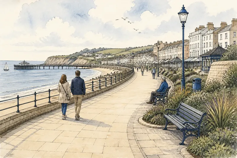
The Sea-and-Sand Palette Is Not a Rule
A sea-and-sand palette can borrow from salt-stained walls, dune plants or harbour paint, helping coastal rooms feel connected to their particular shore.
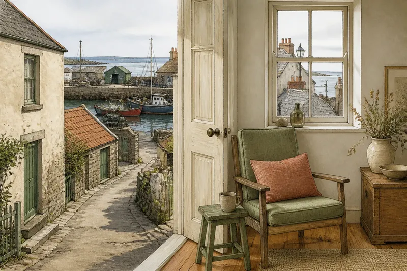
A sea-and-sand palette can begin with a rusted railing or a patch of dune grass, not a blue wall and a beige sofa. Coastal colour feels convincing when it takes its cue from details belonging to a particular shore; the familiar pair is only one possible starting point.
Read the local details
Look at a place in ordinary light, rather than relying on a postcard view. The underside of a pier may hold a deep green shadow; a limewashed wall may shift from chalk to warm grey; grasses can turn from olive to straw. These small, repeatable colours often make a more useful palette than the brightest thing on the horizon.
Choose a few observations and note where they appear: on a painted door, in a tide line, across a roof or among plants. A phone photo can help, but check the colour in person as well. Screens can make muted hues look sharper, and the same wall may read cooler in shade than in direct sun.
Three coastal starting points
Weathered architecture
Salt-marked plaster, faded shutters and old roof tiles offer a palette of softened whites, clay, grey-green and dusky red. This approach suits a home with strong architectural features or someone who wants coastal character without a room dominated by marine blue. It also works well where the view is mostly rooftops, lanes or a sheltered courtyard rather than open water.
Let the most widely repeated surface set the quiet background, then use one smaller architectural detail as an accent. A muted terracotta cushion, for instance, can echo a tile or brick without turning the whole room into a literal imitation.
Dune and salt-marsh plants
Plant life offers a livelier range: sage, straw, sea-glass grey, seed-head brown and the dark green of sheltered leaves. This palette suits people drawn to a softer, more organic room, and it can make sense in a garden-facing space or a coastal interior with timber and woven textures. It is less dependent on having a clear sea view.
Keep the greens varied rather than matching every object to one sample. A greyed leaf tone beside a warmer straw colour feels more like a changing landscape than a coordinated set. Natural fibres, such as linen or jute, can bridge the shades without adding another strong colour.
Harbour paint and working colour
Boats, doors, bollards and painted sheds can contribute sharper notes: vermilion, bottle green, mustard or a particular, slightly faded blue. This route suits a room that needs energy, or a reader who prefers a distinct accent to an all-neutral scheme. It can be especially apt where working harbour details are part of the everyday view.
Use those saturated colours selectively. A painted stool, lampshade or framed panel can carry the reference; repeating the same bright shade on every surface risks making the room feel themed rather than rooted in place. Pair it with a quieter local neutral, such as weathered timber or warm stone.
Match colour to the room
The best source depends partly on what the room already offers. A window facing water may bring in a strong blue-grey that changes through the day, so a softer wall colour can leave space for the view. A north-facing room or one with limited daylight may benefit from the warmth of pale plaster, straw or clay rather than a cool grey-green.
Consider fixed materials before choosing paint: floorboards, stone, tiles and large pieces of furniture will remain in the visual mix. Bring home paint cards or fabric swatches and look at them beside those surfaces at different times of day. A colour that looks gentle against white paper can turn unexpectedly pink beside a warm timber floor.
Say you are refreshing a small sitting room in a harbour village, and its existing floor is honey-toned pine. You notice a muted green on nearby shed doors and a chalky cream on the lane walls. You could use the cream on the walls, bring in the green through a chair cushion and keep the timber visible; the expected result is a room that nods to the harbour without competing with the floor.
How do you choose a palette?
Can coastal colour work without blue?
Yes. Clay, plant green, stone, rust and chalk can all connect a room to the shore when they come from its visible surroundings. Blue is an option, not a requirement.
How many colours should lead?
Start with one quiet base and one or two supporting colours, then judge the balance against the room’s existing materials. A small accent can add character without requiring another broad surface in a competing shade.
What if the view changes through the day?
Choose colours that sit comfortably beside the view in both bright and overcast light. Check samples at different times, and let the shifting view supply some of the variety instead of trying to reproduce every shade indoors.
Should every room share one palette?
Rooms can share a family resemblance without repeating the same colours. Carry one material or subdued shade through the home, then let each room draw a different accent from its own light and outlook.
Choose by looking again
For a clear decision, collect a small handful of cues from the actual place: a wall, a plant, a harbour object or a stone surface. Set samples beside the room’s permanent materials, discard the colours that feel imported rather than observed, and keep the one that works in both daylight and shade. That is a more useful sea-and-sand palette than any fixed formula.
Local paint, stone and plant colours can vary from one street to the next, so the most durable choice may be the one you can still recognise outside your window after the weather shifts.